SaaS · Logistics ✦ UK delivery operator Contract
(01) CASE STUDY
⎯⎯⎯⎯⎯⎯⎯⎯⎯⎯⎯⎯
MAGMA · 2020
PRODUCT / SYSTEM DESIGN

An ops cockpit
for moving parcels
across borders

Magma Management System is a logistics platform for Magma Trading, a UK delivery operator coordinating shipments domestically and internationally. I designed the dashboard, intake and analytics surfaces on top of a modular design system that lets the team add new features and pages with fewer engineering hours.

120+
components, tokens and
patterns shipped in the system
ROLE Product designer, contract
SCOPE Design system + product
INDUSTRY Logistics, B2B SaaS
YEAR 2020
TEAM One designer, two engineers
magma.trading · /dashboard
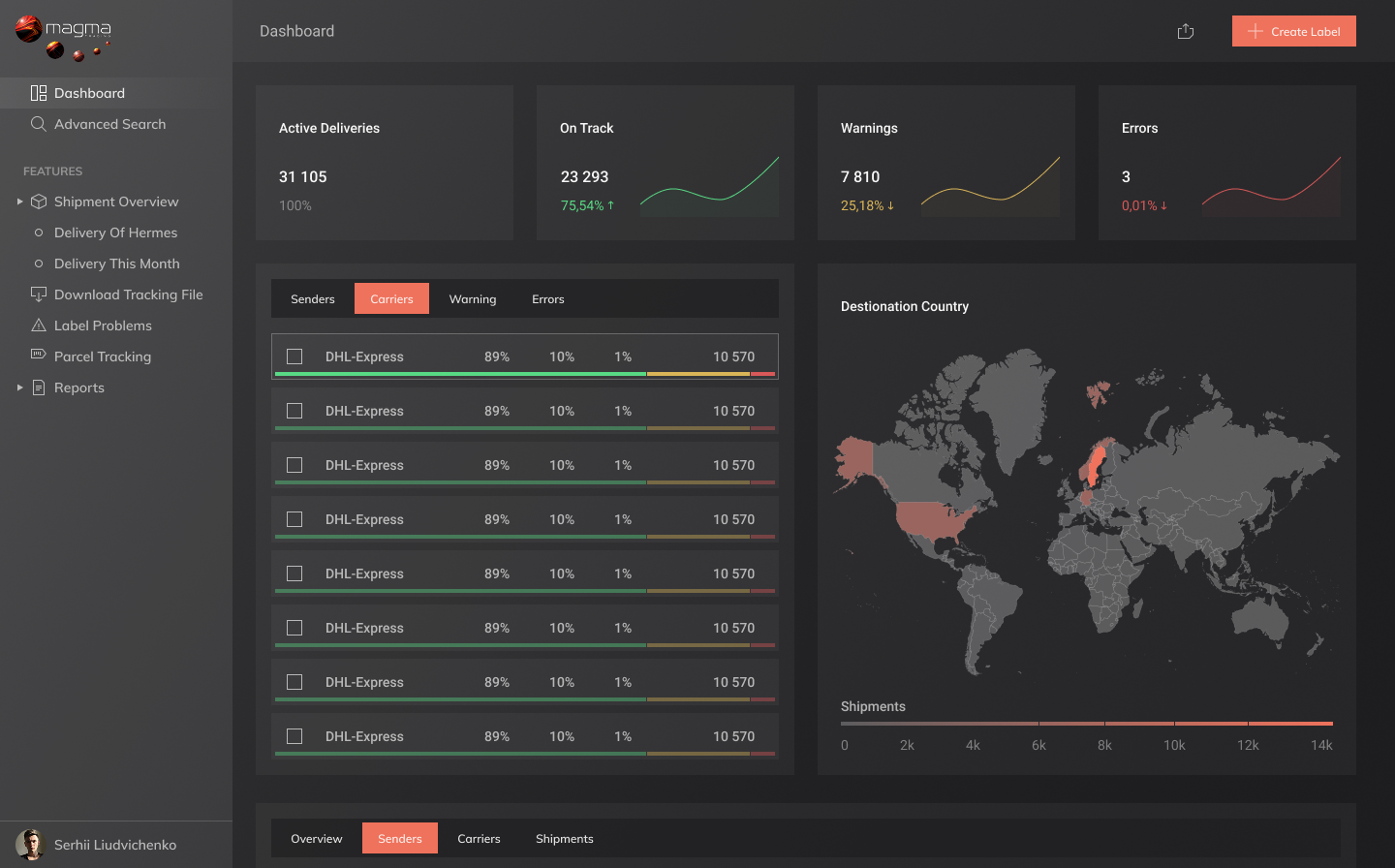
Magma dashboard with carrier KPIs, destination world map and shipment queue
(02) Context

A delivery operator
outgrowing its
spreadsheets.

Magma Trading runs a UK delivery operation that hands parcels off to a roster of carriers, Hermes among them, and ships both locally and internationally. The business had outgrown the patchwork of spreadsheets, third-party portals and emailed manifests it had used to scale. Operators were tab-hopping to find a single tracking number.

The brief was wide. Build the cockpit that runs the day, the intake screens that create parcels and barcodes, and the analytics that prove a carrier is keeping its SLA. Underneath all of it, build a system the small product team can extend without re-litigating buttons and tables every sprint.

Project snapshot
CLIENT Magma Trading, UK
DOMAIN Parcel logistics, last-mile
USERS Operators, account managers
CARRIERS Hermes, DHL Express, Royal Mail
DELIVERY Web app, dark UI
(01)
A system, not a screen

The dashboard was the visible piece. The investment was the underlying system, so the next ten screens could be assembled from components, not redesigned from scratch.

(02)
Designed for density

Operators live in tables. The system optimises for scanning hundreds of rows, with restraint around colour so status reads instantly without lighting up the whole screen.

(03)
Dark by default

A warehouse office runs long shifts. Dark UI is not a style choice here, it is the surface the team will actually sit in front of for ten hours.

(03) The problem

Ten tabs to ship
one parcel.

Before Magma, a single shipment touched a customer CSV, a carrier portal, a barcode printer's desktop tool and an internal tracking sheet. None of them spoke to each other. The team was hiring its way around the workflow rather than fixing it.

The product had to do four things at once. Pull intake into one screen. Generate carrier-ready barcodes. Surface where every parcel was in the chain. Tell management which carriers were earning their margin.

4
disconnected tools
replaced by one cockpit
Friction 01
No source of truth

Carrier portals each told a different story about the same parcel. Operators were calling Hermes to confirm what their own system already claimed to know.

Friction 02
Barcode bottleneck

Barcode generation lived in a desktop app, manually CSV-fed. A wrong column mapping silently mis-routed a batch and was caught at the loading bay.

Friction 03
Blind to performance

No one could answer the question "which carrier is costing us in delays this month" without an analyst building a sheet from scratch.

"I want one screen I can leave open all day, not seven tabs I have to refresh."

Operations lead, kick-off interview
(04) Role

Product designer,
system first.

Contract engagement, embedded with the founder and a two-person engineering team. I owned the design end to end, with a strong lean toward the system layer so the team could keep shipping after the contract ended.

The cadence was weekly: review the operations workflow with the team on Monday, prototype the next screen mid-week, hand off tokens and components to engineering by Friday. The Figma file grew as the product did, library first, screens second.

Responsibilities
SYSTEM Tokens, components, docs
PRODUCT Cockpit, intake, analytics
UX Operations interviews, flows
HAND-OFF Spec, motion, edge cases
W1
Ops interviews
W2
Tokens + grid
W3
Core components
W4-6
Dashboard + intake
W7-8
Analytics + carriers
W9
Docs + hand-off
(05) Initiatives

Four bets.
One platform.

The work clustered into four threads, each one written against the same goal: get the operations team out of their spreadsheets and into a tool that scales with the business.

(01) Deep dive ↓
The design system
Tokens, primitives, dense data components and a documentation layer. The reason new pages now ship in days, not sprints.
↳ 120+ components and patterns
(02)
Operations cockpit
A live dashboard with KPI cards, shipment queues, carrier breakdowns and a map of where every parcel sits in the chain.
↳ Replaced four legacy tools
(03)
Parcel intake + barcodes
Create shipments, validate addresses, generate carrier-ready barcodes and print labels in batch, with audit trail.
↳ Removed the desktop bottleneck
(04)
Carrier analytics
Performance over time by carrier, sender and lane. The screens management opens before signing the next contract.
↳ Visibility on SLA spend
Deep dive
The design system

The screens are
the cheap part.

Most of the investment lives below the surface. A small set of tokens, a grid that holds together at high density, and a component library tuned to the one thing the product does most, show rows of shipments.

The payoff is the rate at which the team now adds new features. A new sender detail page is a recombination of existing components, not a fresh design pass. That is the line on the homepage, made literal: new pages with fewer software development resources.

System surface
TOKENS Color, type, space, radii
PRIMITIVES Button, input, toggle, pill
DATA Table, row, sticky header, filter
FEEDBACK Toast, banner, empty state
DOCS Anatomy, do/don't, code spec
b-color-background
#1D1D1F
color-background-modal
#2F2F31
color-background-dropdown
#414143
b-color-brand-accessible
#EF725C
b-color-text-destructive
#EF5C5C
b-color-text-primary
#FFFFFF · α 96%
Buttons
Create parcel Cancel
Form
Toggle
Status pill
Unprocessed In transit Delivered
Tabs
Senders Carriers Shipments
KPI card
On Track
23 293
75.54% ↑
01
Coral as a single accent, not a palette

One brand colour, applied surgically. Active tabs, primary actions, the status that needs attention. Everything else lives in greys so the coral never has to compete for the operator's eye.

Trade-off. Less room to "decorate" downstream pages. Worth it for the scan-ability operators get on a 200-row queue.
02
Tables are the hero component

The data table got more design hours than any single screen. Sticky headers, batch selection, column-level filters, row hover states tuned for dark UI. Most of the product is a table in different clothes.

Outcome. The intake, carrier and shipments screens share one table primitive. New views compose, they don't rebuild.
03
Docs in the file, not in Notion

Every component page in Figma carries its anatomy, do/don't and the engineer-facing spec. The system stays maintained because nobody has to leave the file to learn it.

Trade-off. Slower to author. Pays back the first time a new engineer ships a screen unsupervised.
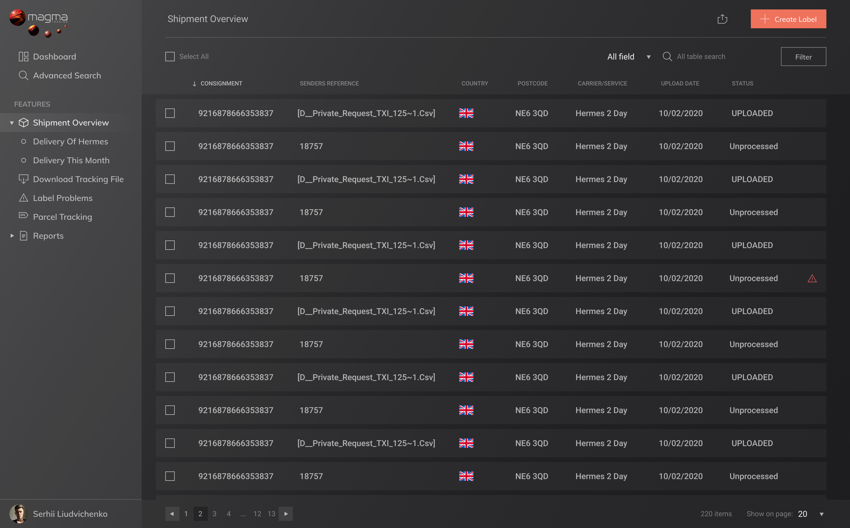
Fig. 02 — Shipment overview, 220 rows / 13 pages
magma.trading · /shipments
Magma shipment overview table with consignment, sender reference, country, postcode, carrier, upload date and status columns
The table primitive in production. UPLOADED / Unprocessed status, country flag column, batch select, paginated filter. Same component powers Senders, Carriers and Reports.
Fig. 03 — The library, named after particles

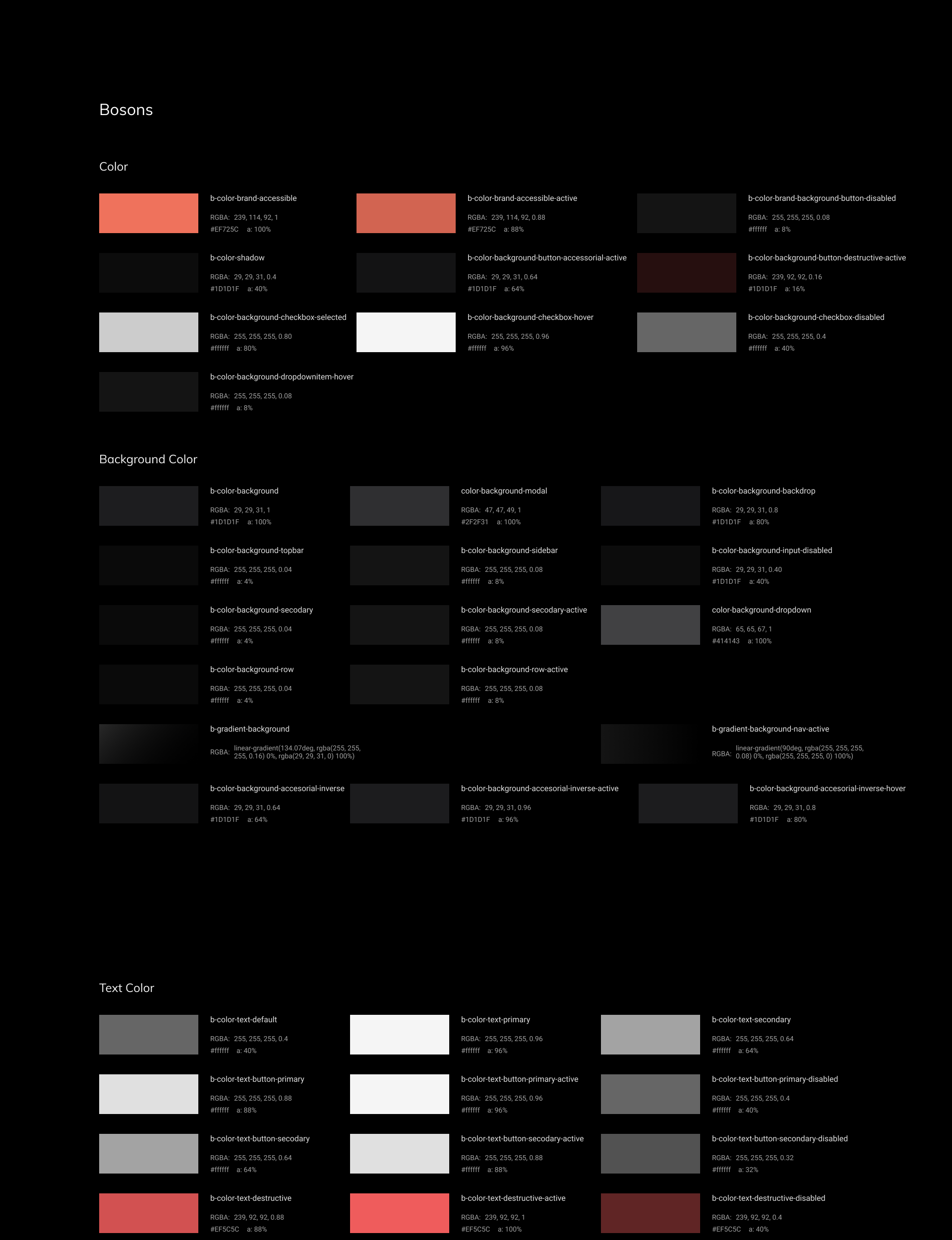
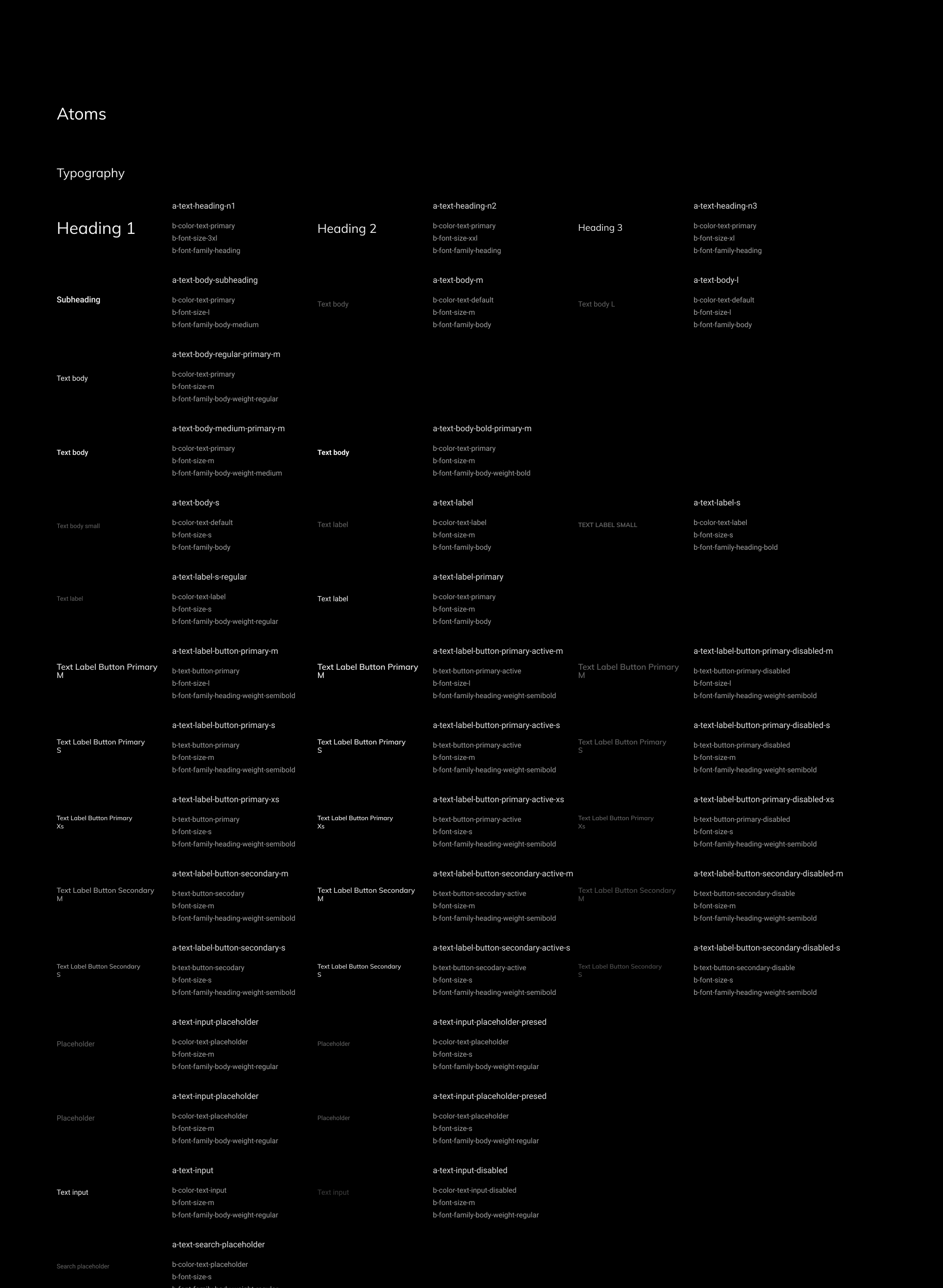
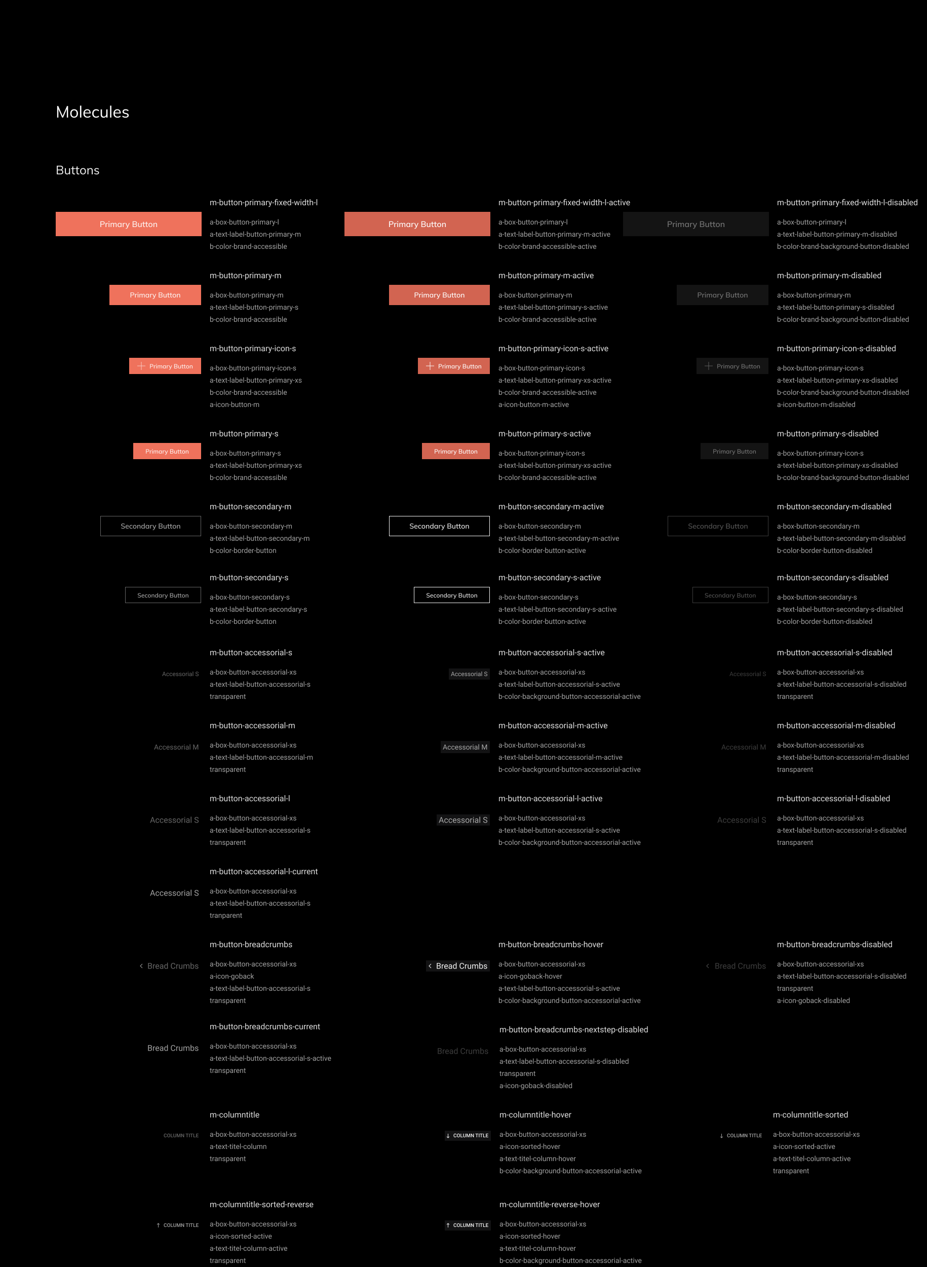
The library is organised by a physics taxonomy rather than the usual atomic-design vocabulary. Bosons are the smallest forces, color and shadow. Atoms are typography and primitive properties. Molecules are the assembled components, buttons, inputs, nav items. Token names follow the same logic, so b-color-brand-accessible is a boson, a-text-heading-n1 is an atom and m-button-primary-m is a molecule.

The naming did real work. Every token in the file maps one-to-one to its name in the codebase, and the prefix tells you exactly where it lives before you open it.

Prefix legend
b- bosons / color, shadow
a- atoms / typography, size
m- molecules / buttons, inputs, nav
s- states / hover, active, disabled
Bosons / Color page from the Magma design system
Bosons / Color
Atoms / Typography page from the Magma design system
Atoms / Typography
Molecules / Buttons page from the Magma design system
Molecules / Buttons
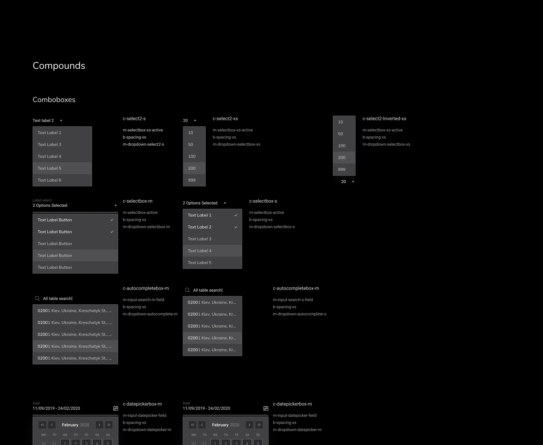
Compounds / Comboboxes page from the Magma design system
Compounds / Comboboxes
(07) Impact

The work,
measured.

120+
Components, tokens
and patterns shipped
REUSED ACROSS
EVERY PRODUCT PAGE
4 → 1
Legacy tools collapsed
into one cockpit
CSV, PORTAL, BARCODE
DESKTOP, TRACKING SHEET
~60%
Less engineering time
per new page
VS. PRE-SYSTEM
STAKEHOLDER ESTIMATE
3
Carrier integrations
at launch
HERMES · DHL EXPRESS
ROYAL MAIL INTL.
0
Spreadsheets
in the daily workflow
FROM 4 SHEETS
PRE-LAUNCH
NOTE. Engineering-time figure is stakeholder-validated, not measured under controlled conditions. Reflects the team's own estimate of cost-to-ship for new pages, before and after the system was in place.
(08) Outcomes

What changed.
What it earned.

BeforeAfter
Four disconnected tools per parcelOne cockpit, one source of truth
Barcodes generated in a desktop app, CSV-fedInline intake, carrier-ready barcodes in batch
Carrier performance lived in analyst spreadsheetsPerformance dashboards by sender, carrier and lane
Every new page redesigned from scratchPages composed from a 120+ component system
Light UI built for a marketing demoDark UI tuned for 10-hour ops shifts
Status communicated through paragraphs of textPills, color and a single coral accent
120+
Components, tokens and patterns reused across every product page
(09) Reflection

What I would
do differently.

What worked
System before screens

Investing in tokens and primitives in week one paid off every week after. By the time the team needed an analytics view, half of it already existed in the library.

One accent colour

Restricting coral to active states and primary actions was the single most useful constraint. It kept the UI calm at high density and made status legible from across the room.

Sitting with operators

Half a day in the warehouse beat a week of remote interviews. Watching someone tab between Hermes, an email and a CSV taught me more than any survey ever has.

What I would do differently
Bring engineering into the system file earlier

I documented late. Earlier paired sessions on the token names would have saved a round of refactoring after the first three screens landed.

Test density with real volume

Tables looked clean in Figma at 12 rows. At 600, the column priorities shifted. I would prototype directly against production-scale data next time.

Plan for a light theme

Dark was the right default for ops. Account managers asked for a light view six months in. The tokens supported it, the component states did not. Both should have been first class.

The dashboard is the visible piece. The system is the work.

Artur Lopez Zarytskyi · Magma Management System · 2020
← Back to portfolio Get in touch